
Row over private school's new emblem which '˜looks like a cigarette company logo'
Students at nearby Akeley Wood School are fighting against a new badge because they claim it looks like a tobacco company logo and they fear they will be mocked for it.
The £12,000-a-year independent school wants to rebrand itself to ‘refine and restate what is intrinsic about Akeley Wood’.
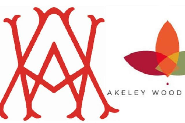

But a group of pupils have launched a petition to stop the rebrand and new logo, which they say is ‘boring and basic’.
A spokesman for the student group, which has collected more than 360 signatures, said: “Changing it to a logo with an absence of quality, creativity and most importantly identity would show a lack of respect to those 70 years of an outstanding school.
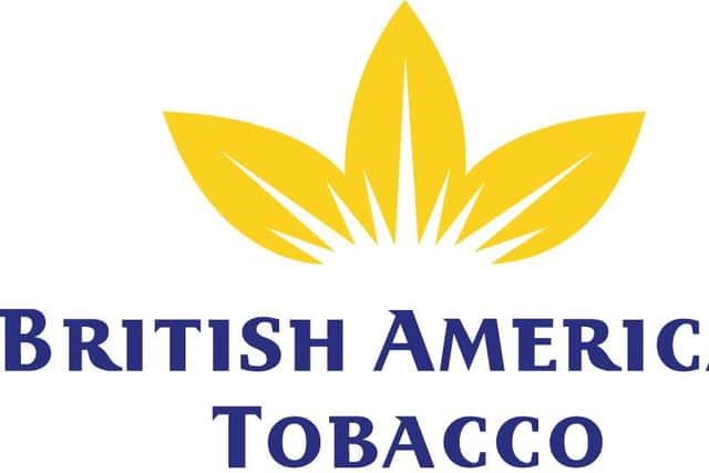
“From seeing just how poorly the new logo has been designed, will reflect the school in a whole entirely different way.
“It is very similar to that of British American Tobacco. We don’t want our school’s identity to look and resemble a multinational tobacco company, do we?”
A final decision will be made next week but the school is currently listening to feedback from parents and pupils.
Headteacher Jenny Clough said: “Inadvertently, this activity has captured the imagination and spirit of our pupils who have worked positively to make their point.
“This week we are listening to the pupil voice. We’ve held pupil meetings across the school and invited comment from parents.”
WHAT DO YOU THINK? Have your say below